The Sky Changed - A Midterm Photoshop Assignment

As I wrote in my previous blog post, I’m in school for a Graphic Design Certificate, and this semesters midterm in Photoshop consisted of colorizing a black and white photo. Please read and check out the final image below.

“Sara Culler: The Sky Changed” 

I had been pondering a new photo series when suddenly it struck me that one of the locations I had in mind for the project would be perfect for this midterm assignment. So I packed my backpack and drove to the location I had in mind. 

Well there I realized how perfect my Ricoh GR was for this task. When shooting in black and white mode, it automatically produces one black and white JPG, and one color version in RAW. I used the raw file as my color palette, save some freehand adjustments, and an imported color palette for the copper roof.

When I got back home and sat down to analyze the image I instantly felt the need to flip the sky and make it the same color as the window facing west. Then I took one of the sky colors and placed it in the same window. Same with the skylights. There I chose to juxtapose the color of the skylight in the shade to a rebellious lighter shade of the original sky, and the skylight in the sunlight, a darker shade of the original sky. All to underline the dissonance felt within, and that on a very personal level. How such a seemingly perfect sky can be so unattainable, and so malplaced…

The walls had its own intricate work. Every block of wall, and every tone shift was done separately. As we all know, the light here in New Mexico, and in Santa Fe especially, reflects off every surface differently. So I chose to do them separately in order to make them more living. On the patchier work, see the example in the front bottom column, where I chose to smudge the edges of the shifts so that they blended together better. All shadows were also amplified with color. 

The only thing not colored is the rough. I attempted to give it a lighter shade of the window colored sky, but it made the total image feel flatter. I added the few colored elements in there to have the gray zone pop, and draw you in further. Leaving the rough uncolored was a much better solution, and I like the additional abstract sense it takes on. 

Well - I hope you enjoy my subtlety abstract work here. It was a really fun assignment, and I’ve actually enjoyed every second of it. 

Midterm_Sara-Culler_The-Sky-Changed.jpeg

Pondering Pantone Colors Of The Year

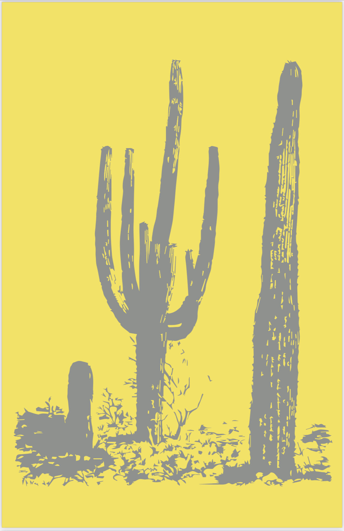
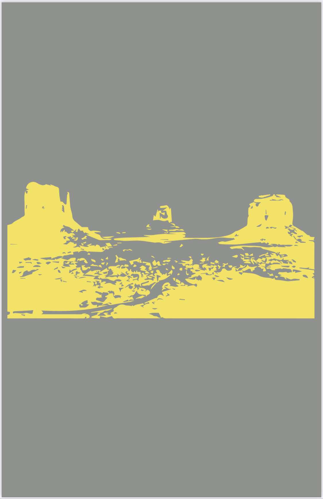
So I started school in January… A 42 year old in school… I started a graphic design certificate program at Santa Fe Community College in an attempt to add a career field, and to dive deeper into my photography. I have been slightly overwhelmed in regards to restructuring my days so that time is more in abundance for mentally finding space to take in school. I’ve struggled to keep up with both photography, and this blog, but hopefully I can find my rhythm and be more regular at it again… Here is a recent piece I wrote for school, pondering Pantone’s colors of the year, Ultimate Gray, and Illuminate, and we were also tasked with making some stencil art in Adobe Illustrator to go with it. Please find both text and images below.

Listening:

Harald Grosskopf - Synthesist

<<<<<<<<<<>>>>>>>>>>

Sitting and writing, pondering Pantones 2021 color of the year selection, which this year meant not one, but two colors of the year - Ultimate Gray, and Illuminate. I am met with a unified collective opinion. 2020 was terrible but it didn’t break us. The gray color represents our endurance and strength, and through it, our perseverance is depicted. The color yellow highlights our future. It underlines warmth, optimism, resilience, and hope. 

I am often the odd bird out. I don't follow mainstream trends and rather question that which attracts the masses. I see trends and can be sensitive to them, but mostly I go my own way. That said, I enjoyed the two colors chosen. 

Ultimate Gray associates directly to concrete or steel, both powerful foundational gray materials that parallel the emotional journey it was, living through the pandemic of 2020. Personally, those emotional references to 2020 are not there. As someone who has lived with a chronic, potentially terminal medical condition, 2020 was not my worse year, and it didn't hold as many challenges as I have faced during other years. I am, however, struck by how the rest of the world has grown emotionally closer to me, luggage-wise, this past year. More people dare to speak of ill feelings and be openly dark, whereas, before the pandemic, people turned a shuteye towards those with patterns of repetitive struggle. Suddenly denying suffering wasn't as easy to do. It was on everyone's doorsteps and transferred to everyone's lips as time went by. If I got to change something, I would rephrase the meaning of Ultimate Gray. It can still represent 2020, but not by way of emphasizing strength and resilience, rather instead by underlining that it is OK to feel that life sucks, even when there's not a raging pandemic to blame it all on. Ill feel and so-called negative emotions are an equal part of being human as good feel, and optimistic emotions are. If there is anything I hope will come out of 2020 by way of reshaping mass opinion, it would be increased respect towards people who have different journeys than you. Everyone can't be a Piglet, some people are Eeyore's, and some are Pooh's. Let's all become accepting that life has its ups and downs, and for some people, it rains and pours. 

Illuminate embodies the epitome of the color yellow, a sunny and uplifting hue. It reminds me of a color I chose for my first apartment after leaving home. Albeit my color was on walls, it was several tints lighter, but still the same hue. It was chosen for warmth and optimism. My separation when leaving home wasn't happy, so I needed to create that space for myself, and therefore I chose the yellow. I agree more with the moral story of Pantone's choice in regards to the yellow. That the color induces all those optimistic emotions, together with its great multi-meaning contrast to the gray. However, I hope the yellow doesn't become a color that represents slipping back into the complacency the masses held before 2020. Then the metaphor is not completely unlike the symbolic tone of yellow in the aging of an old photograph. Instead, I hope we remember what we have endured by viewing the gray, and then highlighting the change in yellow. Remembering the great teacher 2020 was. The lessons we've learned, on a personal, national, and global scale. A color monument if you will. Reminding us that even though we've endured struggle, we came out on the other side, enlightened, emboldened, and both literally, and figuratively illuminated. 

IMG_0283.jpeg
IMG_0285.jpeg